What is Mobile SEO
Mobile SEO is the process of optimization of a website keeping users in mind who are accessing it on a mobile device, such as a smartphone or tablet. Mobile SEO includes designing responsive website so that it automatically adjusts to the screen size it is being viewed on. Optimizing page load speed for slower mobile internet connections and ensuring that the website’s content is easily accessible on a small screen. Optimizing your website for mobile often ensures that the site is properly configured for Google’s Mobile-First Index, which prioritizes mobile-friendly websites in search results.
It has become very important to focus on the best SEO practices for mobile searches along with your overall SEO strategy. If you want to know more about SEO then please read our article on what is SEO?
Why is Mobile SEO important in 2023?
Mobile SEO will be important in 2023 because of the increasing number of people using mobile devices to access the internet. As of 2022, it is estimated that around 59% of all internet traffic worldwide comes from mobile devices. A significant portion of a website’s potential audience may be accessing it on a mobile device. If the website is not optimized for mobile devices, it may be difficult for these users to navigate or access the content.
Additionally, Google’s search algorithm prioritizes mobile-friendly websites in its mobile search results, so a website that is not optimized for mobile devices may not rank well in search results, leading to fewer visitors. Mobile SEO becomes extremely important to improve the user experience, increase the website’s visibility in search results and increase the conversion rate which can lead to increased revenue for the business.
Why Auditing a website for mobile SEO is important?
Auditing a website for mobile SEO is important because more and more users are using mobile devices to access the internet, and search engines are placing a greater emphasis on mobile-friendliness in their search rankings. IT can help you identify any issues that may be hindering your website’s performance on mobile devices and give you recommendations on how to improve it.
Here are some specific reasons why auditing your website for mobile SEO is important:
Improved User Experience: A mobile-friendly website offers a better user experience to mobile users, making it more likely that they will stay on your site and interact with your content.
Better Search Rankings: Mobile-friendly websites tend to rank higher in search results, especially for searches performed on mobile devices.
Increased Traffic: By improving your mobile SEO, you can attract more mobile users to your site, increasing your overall traffic.
Higher Conversion Rates: A better mobile user experience can lead to higher conversion rates, as users are more likely to complete a desired action on your site, such as making a purchase or filling out a form.
In short, auditing your website for mobile SEO can help you provide a better experience to your mobile users, improve your search engine rankings, increase your traffic, and drive higher conversion rates.
Points to check while Auditing a Website for Mobile SEO?
To audit a website for mobile SEO, you can follow these steps:
Step 1 – Test the website on various mobile devices
Step 2 – Check for a mobile-friendly design
Step 3 – Check page load speed
Step 4 – Check for clickable elements placement
Step 5 – Check for broken links
Step 6 – Check the content
Step 7 – Check for structured data
Step 8 – Check for speed on 3G connection
Once you’ve identified any issues with the website’s mobile SEO, you can then fix them by making design changes, optimizing images, or fixing broken links. Keep in mind that mobile SEO is an ongoing process, and you should regularly check your website’s mobile performance and make adjustments as needed.
Strategies for supercharging mobile SEO
Here are some strategies that you can implement to optimize your website for mobile SEO:
Optimize for mobile-first indexing:
Google’s mobile-first indexing means that the mobile version of your website will be used to index and rank your website in search results. Make sure your mobile site is optimized for search engines by including meta tags, header tags, and keyword-rich content.
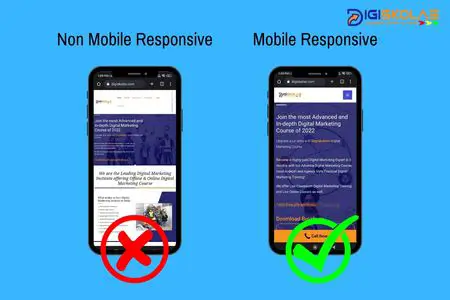
Mobile responsive website design:
Responsive design ensures that your website adjusts to the size of the user’s device, providing a seamless user experience. This is important for mobile SEO as it improves the user experience and can help improve your website’s search engine rankings.

Optimize the website’s clickable elements:
When clickable elements on a website are too close together, it can cause a number of issues for users. One major problem is that it can make it difficult for users to accurately tap or click on the element they intend to interact with. This can lead to frustration and a poor user experience. Additionally, if the clickable elements are too close together, it can increase the likelihood of accidental taps or clicks, which can cause confusion and lead to unintended actions. It can also make it hard for users with motor impairments to use the website or app.
It’s important for web and app designers to ensure that clickable elements are spaced apart enough to prevent these issues and make it easy for users to navigate the website or app. A good practice is to have at least 7mm of space between clickable elements, this allows users to be able to select the correct button even if they have a slight miss-tap.
Optimize page load speed:
Mobile users expect fast page load times, and Google’s algorithm takes page speed into account when ranking websites. Optimize images, minify code, and reduce redirects to improve page load speed on mobile devices. You can use Google’s page speed insight tool to get a detailed report of code and content-related issues which hampers the page speed.
Use structured data:
Structured data, also known as schema markup, helps search engines understand the content on your website. Use schema markup to provide additional information about your website’s content, such as product details, reviews, and pricing.
Optimize for local search:
Many mobile users search for local businesses, so it’s important to optimize your website for local searches. Include your business name, address, and phone number in your website’s header or footer, and make sure your business is listed in local directories.
Create mobile-friendly content:
Make sure your website’s content is easy to read and navigate on mobile devices. Use short paragraphs, headings, and bullet points to break up text and make it more readable.
Use AMP (Accelerated Mobile Pages):
AMP is an open-source framework that allows developers to create fast-loading web pages for mobile users. It can help increase website traffic and improve the user experience, which can lead to better search engine rankings.
Use mobile-specific keywords:
Use keywords that are specific to mobile users in your website’s content and meta tags. For example, if you’re a local business, use keywords like “near me” or “nearby” in your content.
Monitor your mobile traffic:
Use analytics tools to track your website’s mobile traffic and user behavior. This can help you identify which pages are performing well and which need improvement, and make any necessary adjustments to your mobile SEO strategy. It is important to note that mobile SEO is an ongoing process, and it is important to keep an eye on the changes in the mobile search algorithms and update your website accordingly.
In conclusion, optimizing for mobile SEO is essential for any business looking to reach and engage with customers through their smartphones. This includes having a mobile-friendly website, using responsive design, and implementing technical SEO best practices such as structured data and page loading speed. Additionally, it is important to have a solid mobile strategy in place for local SEO and social media to ensure that your business is easily discoverable on mobile devices. By focusing on mobile SEO, businesses can improve their search engine visibility, user experience, and ultimately drive more conversions and sales.
Please click the icons below to share this article with your community.
